
iOS 26 and Next-Generation Design: What is Liquid Glass and How User Expectations Are Changing
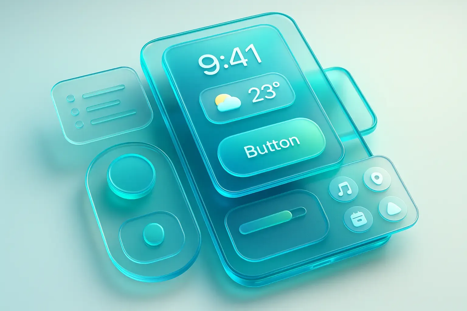
Liquid Glass: Why It Is More Than a Redesign
Liquid Glass will become the foundation of the interface across the entire Apple ecosystem. Its goal is to unify the design language across iOS, iPadOS, macOS, watchOS, and tvOS, creating a sense of a cohesive digital space. Users accustomed to this aesthetic will perceive all digital interfaces differently. Let’s review the key principles of this update:
- Depth and Volume: The interface transitions from a flat screen to layers with varying transparency. Elements "float" over each other, as if positioned in real space. This creates an effect of depth and natural lighting.
- Smooth Animations: Any movement within the interface is accompanied by realistic inertia: acceleration, deceleration, and smooth transitions. This provides a more comfortable, intuitive interaction.
- Detailing: Minimalism remains, but it has become more refined — everything from icons to micro-interactions is meticulously crafted. This fosters a feeling of quality and user-centric design.
Liquid Glass is not the only change. The iOS 26 updates also impact the main use scenarios:
- Lock Screen and Widgets: Watches and system elements adapt to the background by changing size, color, and contrast to remain always readable. Widgets gain a glassy effect and light animations: tilting the device creates a sense of depth.
- Camera and Photos: The shooting interface is reduced to two gestures: horizontal swipe switches modes (photo/video), and vertical swipe opens settings. The screen is free of icons, and responsiveness is noticeably faster — Apple emphasizes speed and clarity over a plethora of functions "at your fingertips."
- iMessage and FaceTime: Control panels fade out during reading or calls and reappear with a tap. The interface doesn’t block content or impose a set workflow.
- Music and Safari: Navigation bars hover over content and shrink during scrolling. In Safari, tabs are grouped and shift to free up space for the webpage.
In the end, buttons and panels become less intrusive, immediately drawing attention only to what matters — messages, photos, videos. Users don’t have to think about where to press or how to open something; it’s intuitive. This will soon be the standard expectation for any interface.
What This Means for UI Design in 2025
Apple consistently advances its new versions quickly. According to their data, over 80% of devices upgrade within three months of release. This means that soon, the visual standard for most users will shift to visuals with more depth, fluidity, and attention to detail. This will become the new norm. The earlier businesses start reflecting this in their products, the higher their chances of retaining user engagement and trust. It’s not necessary to copy Apple, but understanding the new visual experience users will expect from your app is essential.
Key considerations for UI design:
- Transparency and Layers: Think about visually reducing clutter. Users expect "air," depth, and smooth transitions between layers, rather than rigid boundaries and overloaded screens.
- Natural Animations: Element behavior is no longer just a visual trick but part of the logical operation. Movements should be understandable and help users orient themselves, not hinder them.
- Minimalism and Detail: Less is more, but with precision. Users notice if something looks sloppy, which directly affects trust.
- Context Adaptation: Interfaces must be flexible. For example, controls may appear only when needed rather than occupying constant space.
- Speed of Response: The new benchmark is immediate response. Any delays are perceived as errors. Fast launch times and reactions should be a priority.
- Universal Design: Users will expect that products look and feel consistent across all devices — smartphones, tablets, TVs, and computers. Interfaces should be harmonized for all form factors.
The DigiNeat team carefully monitors changes in user behavior and visual standards across platforms. We analyze where businesses earn, what steps users need to take, and what might hinder them. Based on that, we build scenarios, prototype solutions, and test against real audiences. We measure load times, readability across screens, gesture fluidity, and animation performance. The result is an interface that looks fresh from day one, loads in seconds, and helps businesses achieve their KPIs faster.