
How UX Design in Fintech Builds Trust and User Retention
It might surprise you to learn that optimized UX design can increase customer retention rates by up to 30%. But poor user experiences can persuade users to look for alternatives within seconds of downloading an app.
Whether you’re improving an existing fintech platform or launching a startup, you might want to keep reading. We’re about to look at what constitutes great UX design in this unbelievably competitive market.
Signalling Trust Is an Integral Part of UX for Fintech
Trust should be earned from the second a user opens your fintech app. And that’s only right. After all, would you feel comfortable sharing sensitive financial data and entrusting your money to a service with inferior design elements?
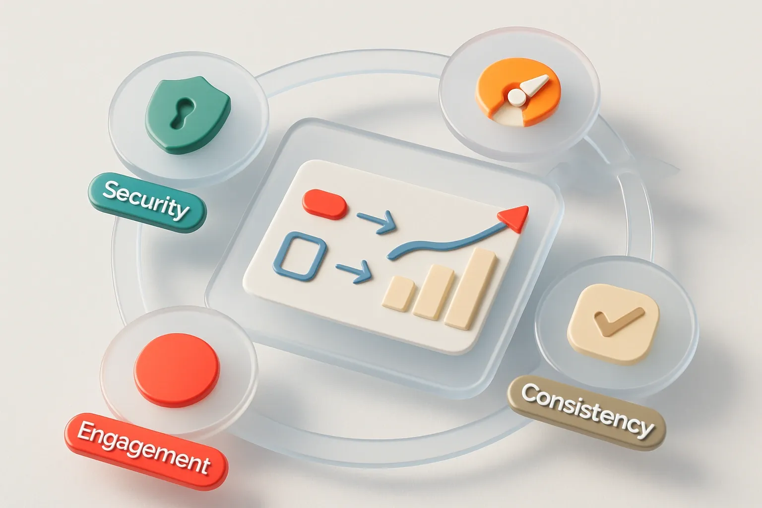
It’s not enough to make things work. Fintech platforms must continually reassure users through proven UX development elements. But when they’re successful, security, reliability, and professionalism become obvious — all trust signals that can make a fintech platform a commercial and critical success.
Trust is earned visually long before it’s earned verbally. Flow and UX work together to communicate stability — minimizing doubt and maximizing confidence.
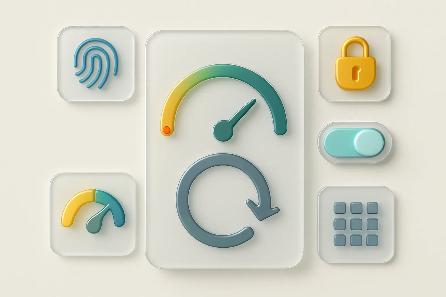
The core UX trust-building elements that top fintech products implement effectively are:
Consistent Visuals
Details matter when it comes to trusted UX for fintech. Typography, calming color palettes, grids, and iconography are just a few of the elements used to instill trust.
Our job as UX designers is to minimize cognitive load, demonstrate inherent stability, and create the feeling of reliability in the minds of users. And all of this must not come at the expense of consistency.
Seamless Performance
Speed is strangely soothing to fintech users. Fast loading, smooth animation, real-time progress feedback, and zero lag all combine to ease user anxiety. But when things are slow or clunky for users, trust quickly wanes, and that’s a recipe for reduced engagement and, ultimately, churn.
Security Measures
The sight of a well-known or verifiable security logo can put even the most nervous of fintech users at ease. A biometric login prompt or a padlock icon in the right place can be all a user needs to relax and proceed with confidence.
Social Proof
Demonstrate authority with partner logos, certifications, and user testimonials. These familiar cues reduce uncertainty, especially for new users, by showing them that others already trust a platform with their most sensitive financial information.
The Common Pitfalls of UX Mistakes — and the Cost of Making Them

As an established UX design agency, DigiNeat has seen firsthand some of the UX mistakes that can blight fintech platforms before they have a chance to grow. Even the strongest trust signals don’t count for much when the UX design just isn’t up to scratch.
Put yourself in the shoes of a fintech user. It’s not difficult, as we all now have to deal with financial and banking applications on a regular basis.
Whether you’re paying bills, transferring funds, making investment decisions, or planning for your future, even the smallest of frustrations can develop into major headaches. And when this happens, loyal customers can quickly think about jumping ship to avoid any potential for anxiety.
Poor design doesn't just annoy; it destroys confidence, generates support tickets, and fuels churn before users ever form habits.
The most damaging UX mistakes can have a profound effect on startups and established fintech apps alike — here are just a few of the worst:
Complex or Lengthy Onboarding
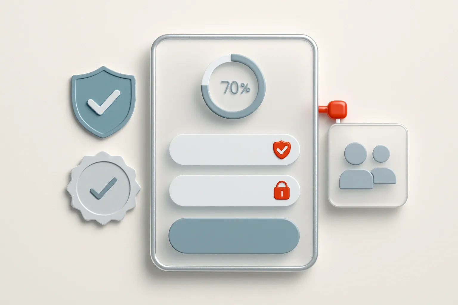
When getting started becomes stressful and time-consuming, many users give up. Never to return. Endless forms, complicated KYC questions, and a lack of progress indicators can create the feeling of being trapped. And that’s usually bad news when it comes to retention.
According to a recent study, 70% of financial institutions worldwide lost clients due to slow and inefficient onboarding. Get this initial interaction wrong with substandard UX, and you can guess what comes next for your platform.
A Lack of Clarity
Fintech users demand clarity at all times. When things become confusing or unclear, confidence takes a swift dive. But what are the issues that can cause this reaction among users? Well, in our experience, the overuse of financial jargon, vague wording, and hidden costs are some of the most common causes.
Confusing Navigation
Have you ever been greeted with the message “Something Went Wrong”? What went wrong? Why did it go wrong? What happens next? Does the user have to do something? This kind of vague message leaves users powerless—especially with real money. The result? User frustration, an overloaded support team, and, ultimately, uninstalled apps!
Hidden Processes
Fintech users don’t like complicated processes, particularly when cancellations, refunds, closures, and transfers are concerned.
When endless steps are involved in a process, and users aren’t warned upfront, feelings of being trapped, distrust, and negativity can take over. And these emotions are often the primary drivers of churn and permanent reputational damage.
Delivering Clarity When Things Get Complex Breeds Confidence
Some financial processes are complex, and there’s very little even the best UX designers can do about them. However, to keep users in control, good fintech UX doesn’t hide complexity — it breaks it down through clever design choices.
Users are savvy. They know that certain financial transactions are complex. In fact, complexity can sometimes breed confidence — but only when users know what’s happening and why. When tasks can be finished quickly and confidently, those users are more likely to keep returning.
A good UX design process often includes the following strategies to turn complexity into user confidence:
Progressive Disclosure
Reveal information gradually on a step-by-step basis, showing only what's needed at each moment. This prevents overload during high-anxiety actions such as transfers or investments.
In a recent fintech case study, a UX redesign for a digital investment platform using progressive disclosure increased the conversion rate by almost 25%. The average useris comforted when complex processes are broken down into digestible chunks. That comfort is enhanced when there’s a clear indication that each “chunk” has been completed successfully.
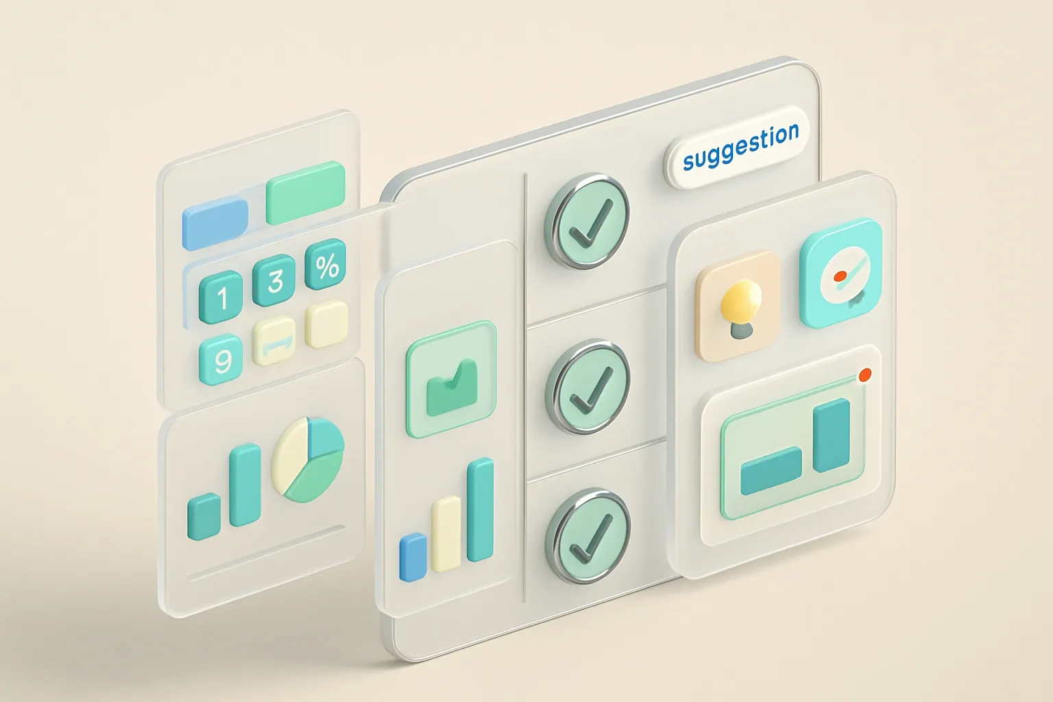
Turning Numbers into Visuals
Wherever possible, talented financial UX designers make numbers easier to digest with charts, graphs, and simple visuals. Reduce confusion around things like balances, spending, and portfolio performance with some eye-catching graphics when and where it makes sense.
Human-Centric Guidance
Users don’t want jargon, as it makes them feel like they’re conversing with experts or, even worse, bots. They prefer clear, plain language — the kind that real humans use! Add tips, explanations, and real-time previews to minimize uncertainty.
Personalization
Effective fintech UX development assesses user behaviors and adapts the individual’s experience accordingly. Pre-filled forms, suggestions, and unsolicited tips combine to make users feel like their needs are being listened to.
Fintech UX Design Done Right Can Elevate Your Platform for Growth
As UX designers, we know that every decision we make can do one of two things: build confidence or spark doubt. We know exactly how to deliver the first of these results.
Done right, intuitive UX turns complex financial tasks into seamless, reassuring experiences that keep users coming back.
At DigiNeat, we create fintech products that users trust. We’ve been doing it for years. Let’s work together. With the right UX for your fintech platform, the sky’s the limit for growth and brand awareness.
Get in touch today to arrange a free strategy session.